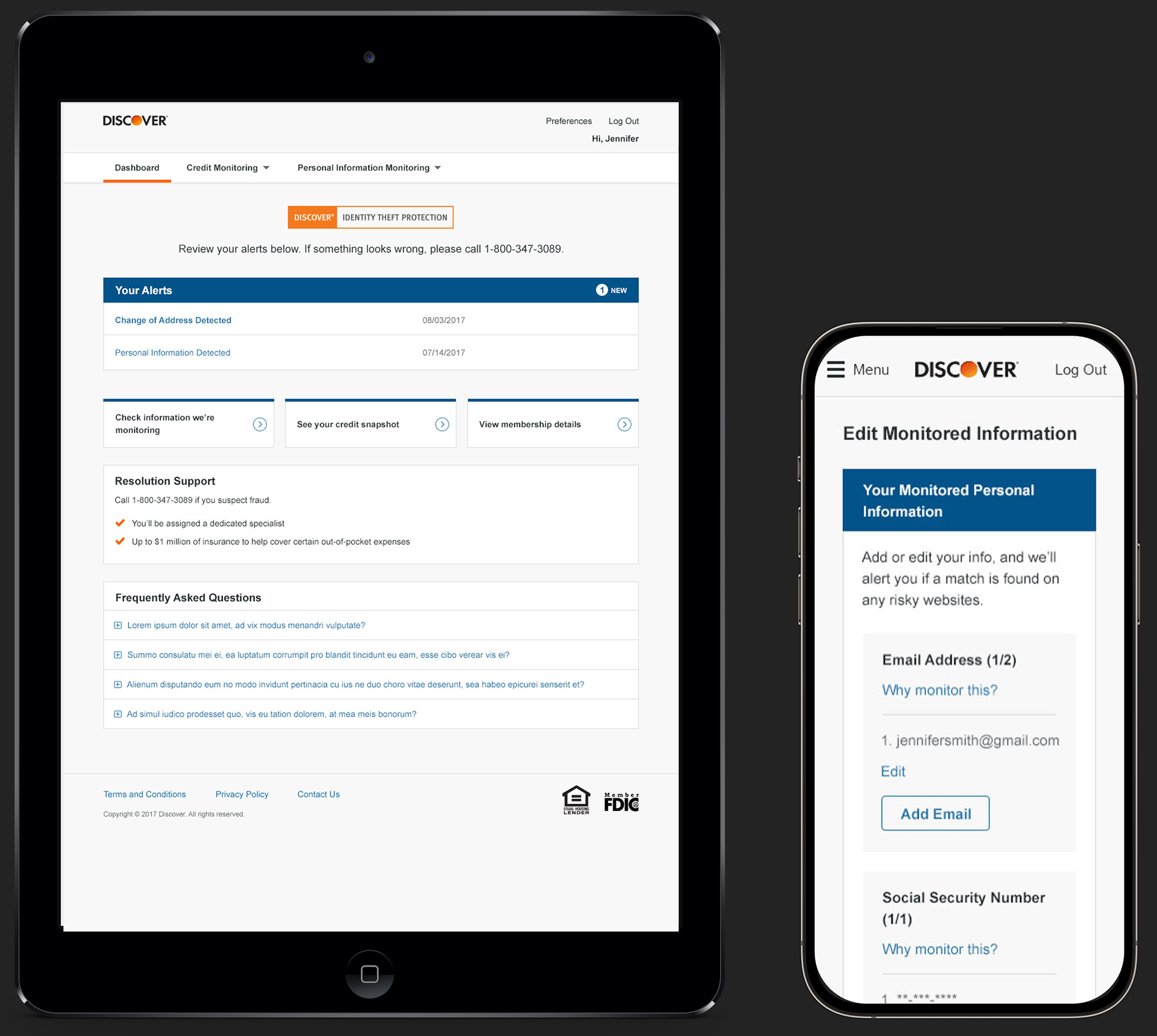
Initial Product Dashboard
Here's the dashboard, which had some design limitations due to it being hosted by a third party vendor. The primary purpose was to provide access to alert details, but I also wanted to give users a clear path to other critical info with the 3 callouts below. Another priority was to make sure customers knew they could reach out to a fraud specialist for assistance.
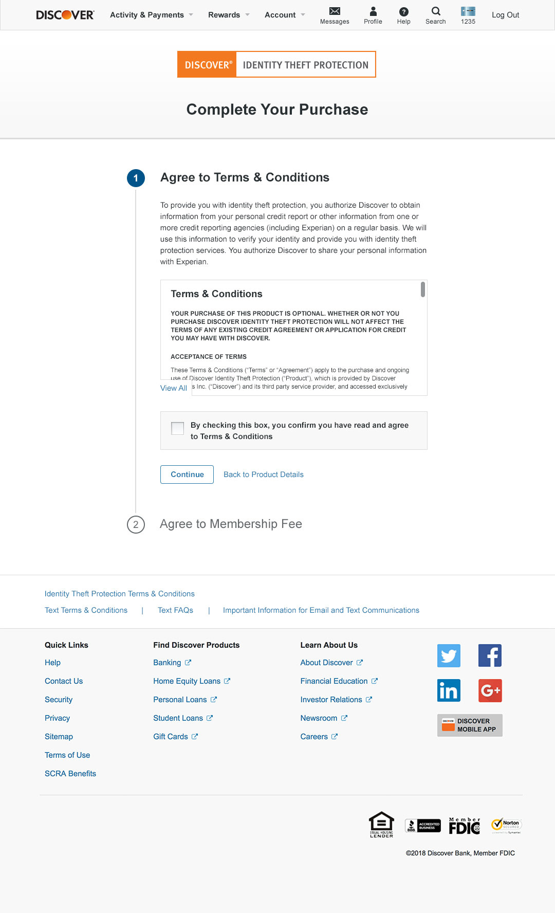
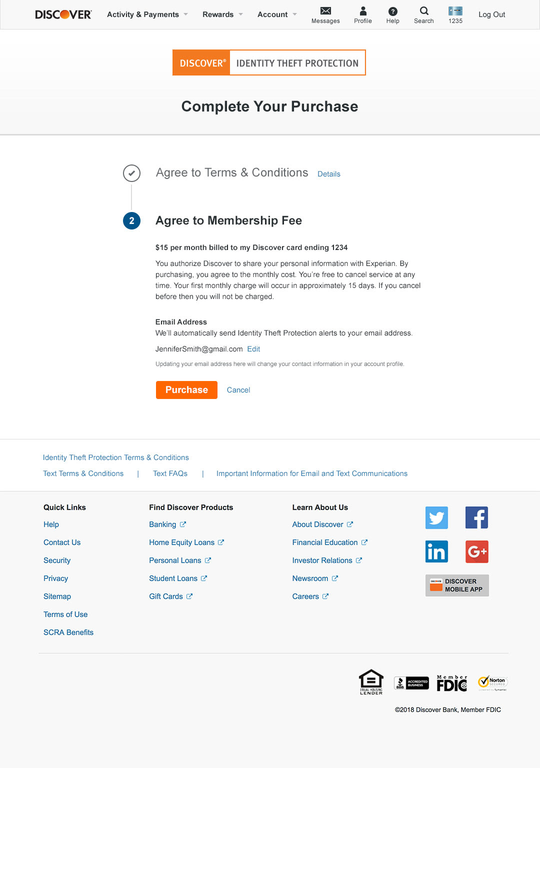
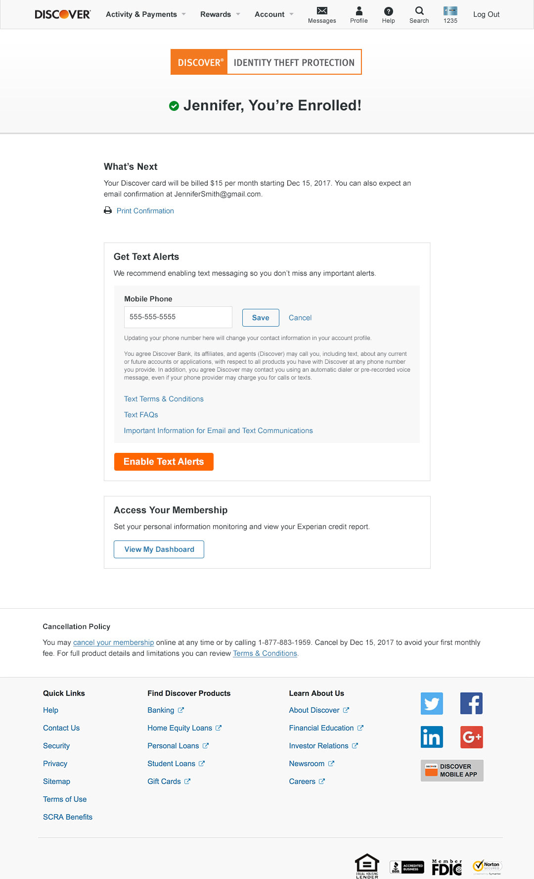
Enrollment Process
Part of the first engagement was to simplify the enrollment experience, so I worked closely with my UX designers to make important info like terms easily available, but not overwhelming, and to also bring clarity to the $15 monthly fee with a quick 2-step process. And given the timely nature of fraud, it was also important to get users to opt into text alerts so they could be notified about potential problems quickly. So we made a very obvious post enrollment step of getting customers to enable text alerts.
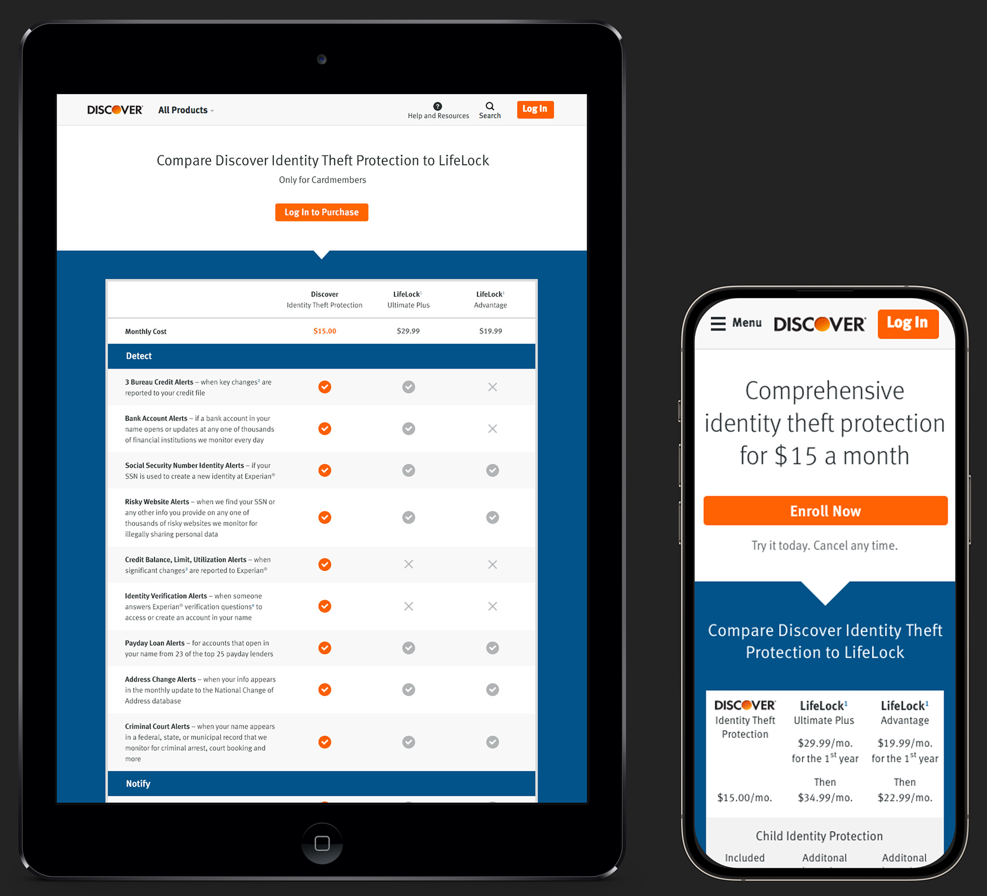
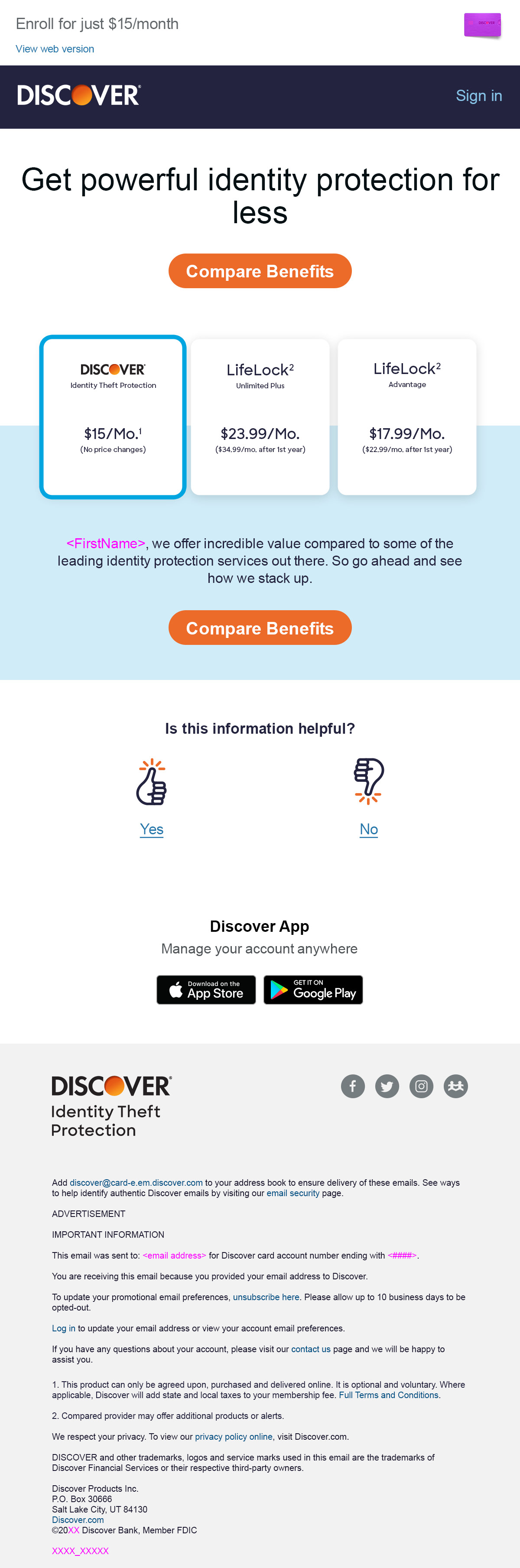
Acquisition Product Page
We tested a number of concepts for public acquisition landing page, and ultimately used the idea of a comparison chart with two of LifeLock's main products. This clearly demonstrates that Discover ITP is a great value that offers similar features to LifeLock's higher tier product—for roughly half the cost.
This acquisition page has proved to be almost too effective. Because we've tried to introduce additional content that we think users would find helpful, but the simple chart page keeps winning out.
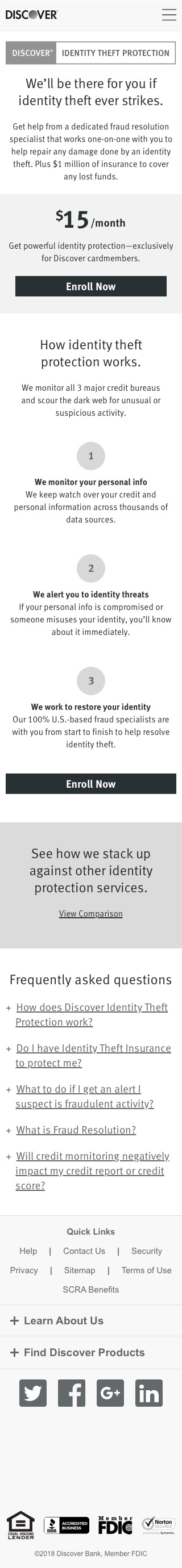
Product Page Positioning Testing
Here are wires I created for one of the landing page tests we conducted. I used different product positionings, e.g., focusing on resolution, brand trust, peace of mind, value, and scary threats, as well as how to communicate important aspects of the service. We got good learnings, including indications that users liked seeing additional content to make a purchase decision, which would be incorporated for later in-market testing.

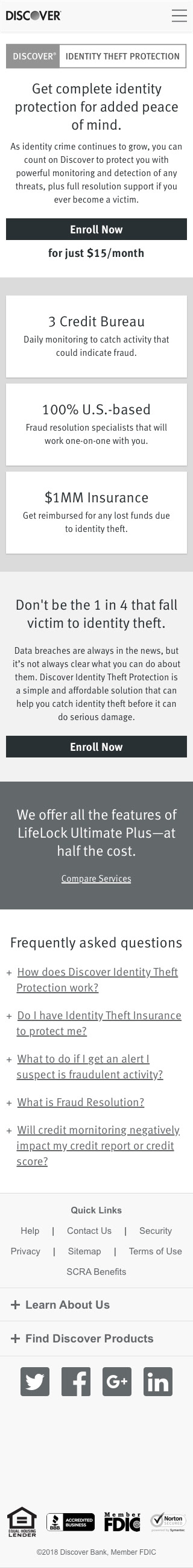

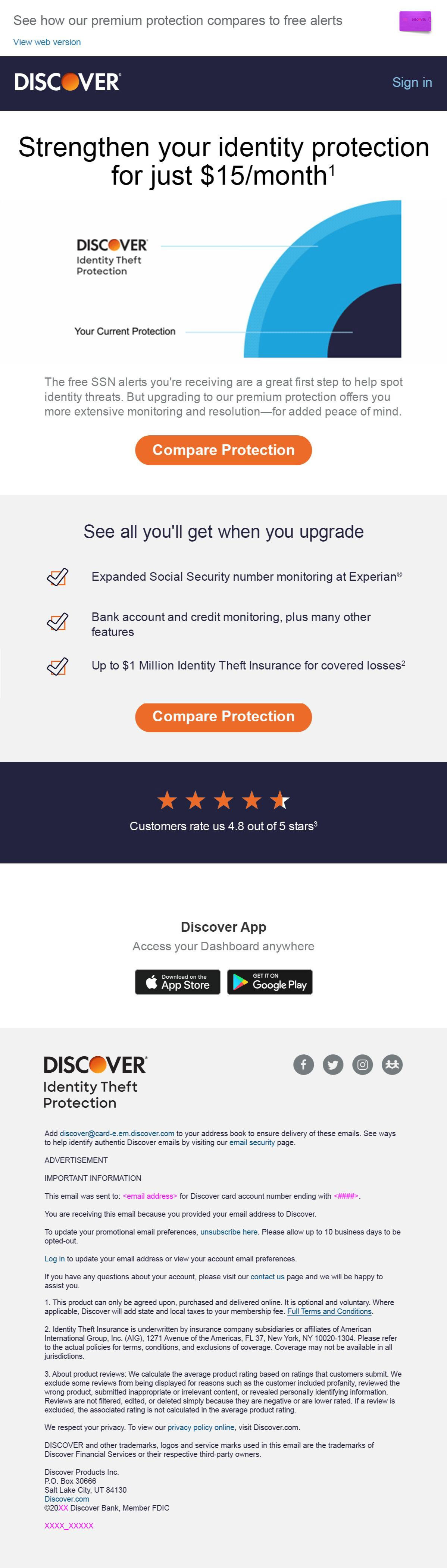
New Product Page Design
Here's a newer update to the landing page that collapses the comparison chart, incorporates additional content, and uses new branding elements to modernize the page with current design guidelines.
It is being tested against the "chart only" page and I hope it wins!

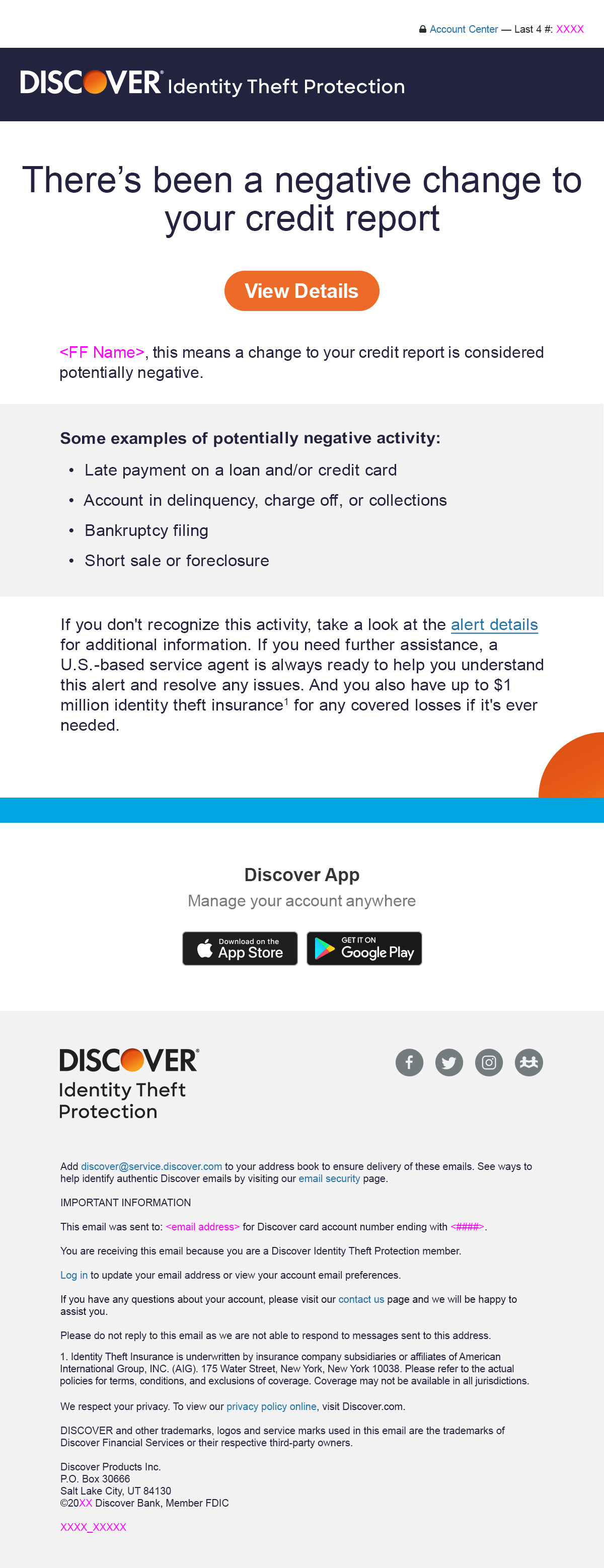
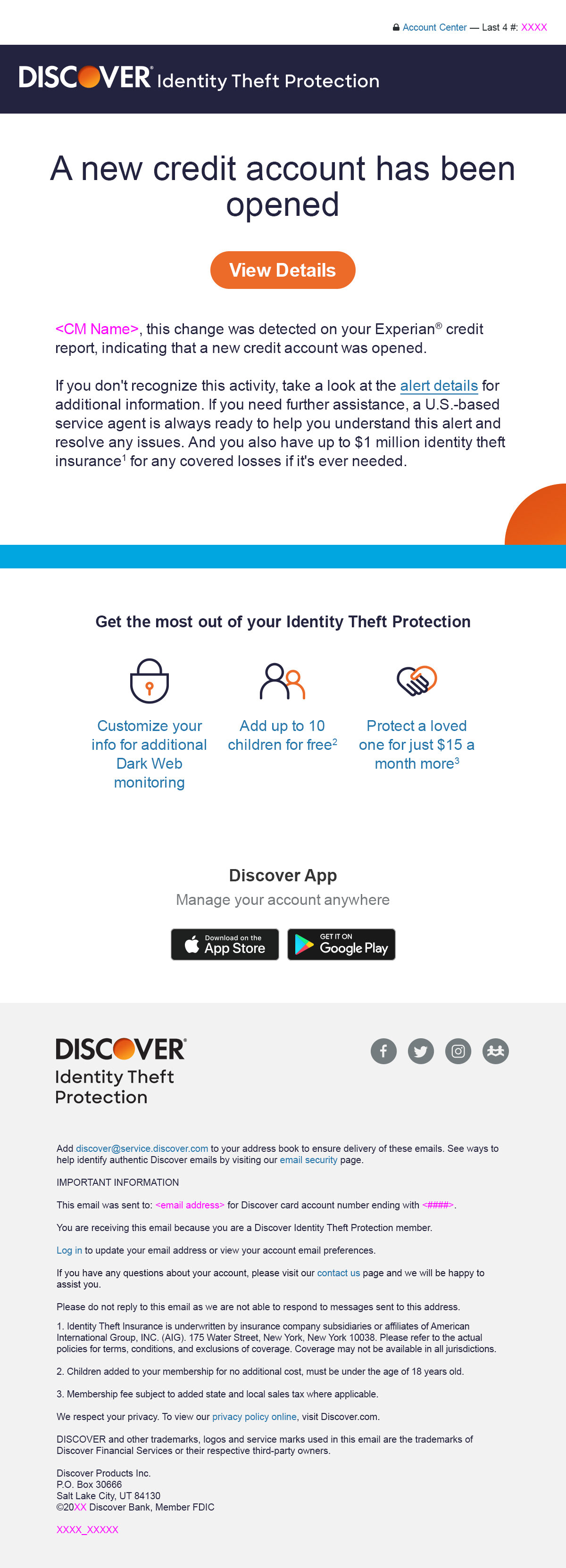
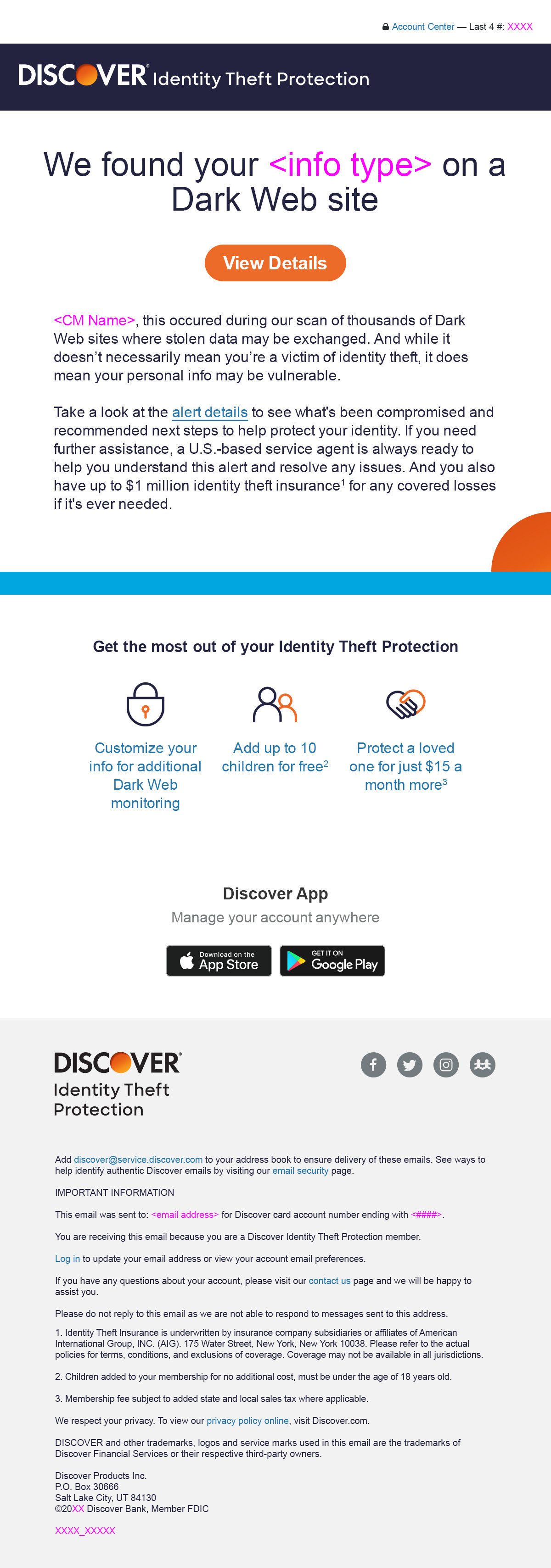
Updated Activity Alerts
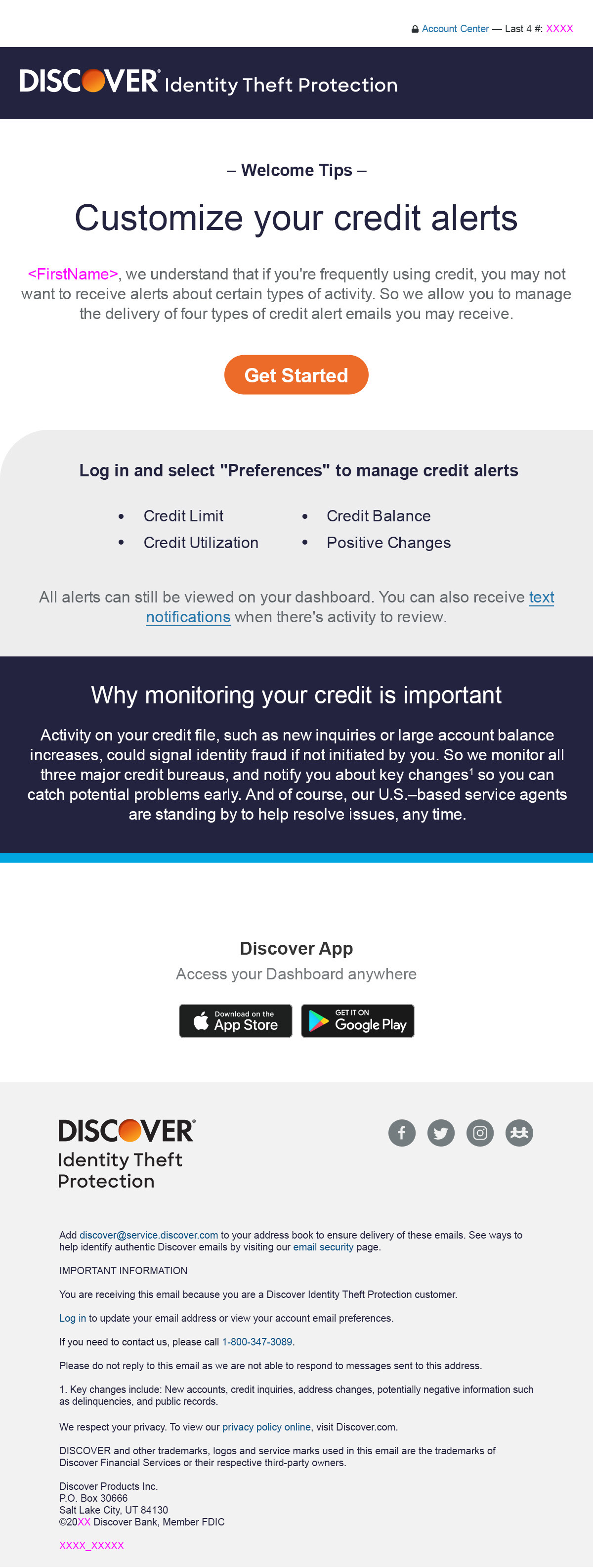
I created the initial set of alerts that would inform customers about lots of different activities that could signal potential fraud. And many years later, I updated them with a number of improvements shown below. These included using updated brand guidelines, a clear product name header so these alerts wouldn't be confused with other Discover communications (I fought for years to get this in), and more concise messaging that focused users on viewing details of the alert on their dashboard.
I also incorporated grey "explainer" areas on the emails for some of the less familiar alerts to help provide additional content about what may have triggered an alert (which is usually not fraudulent) so users could panic less that something was wrong, and the business would receive less call volume.

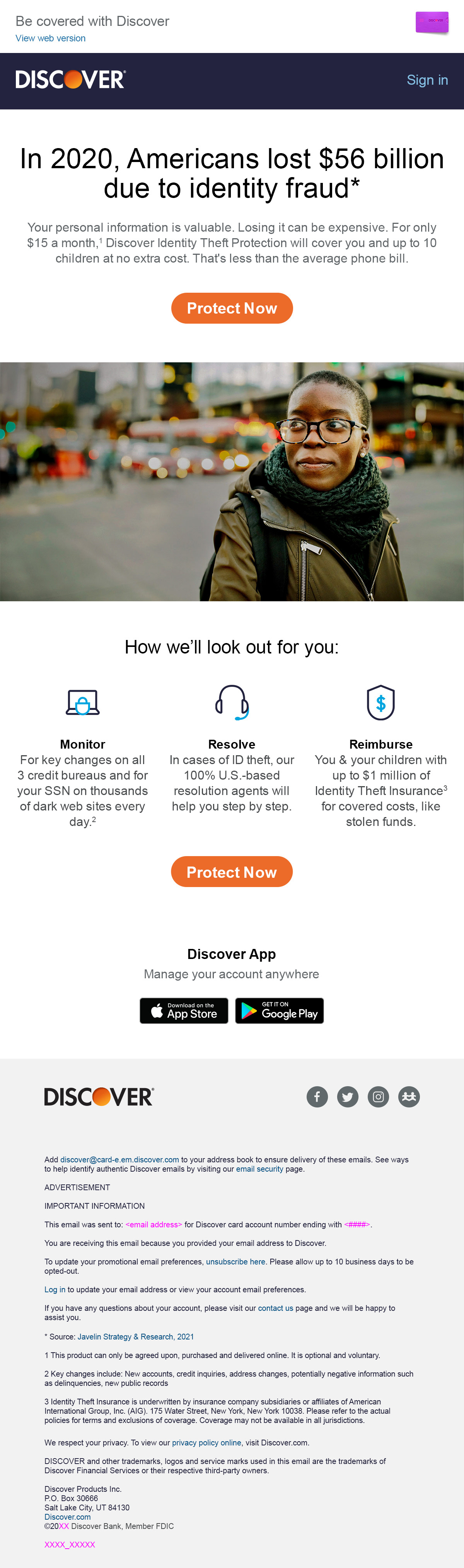
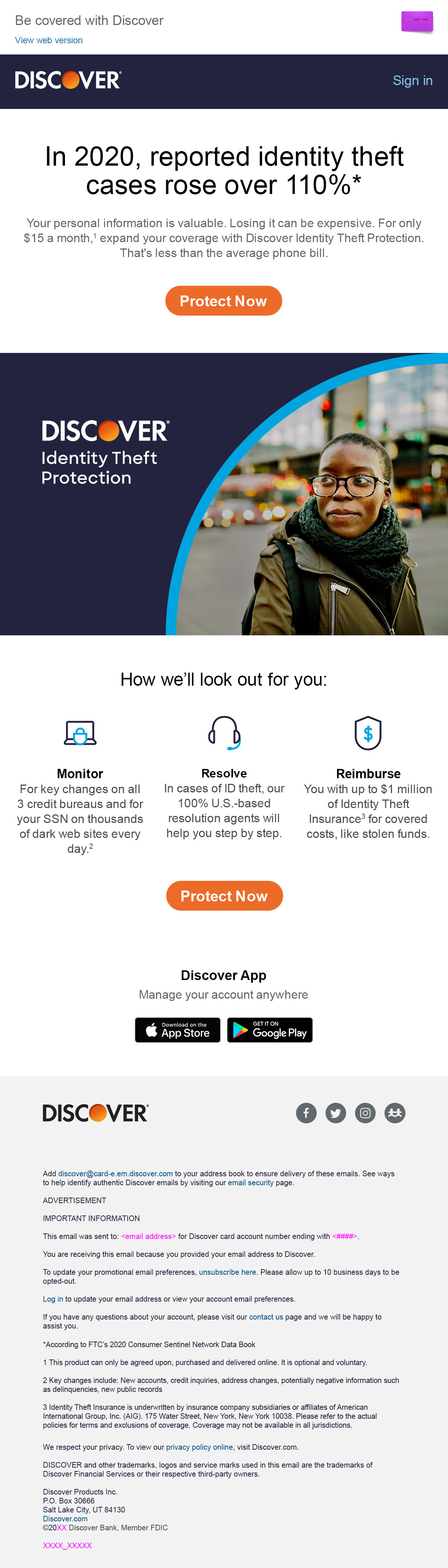
Email Optimization
We performed all kinds of email optimizations and tests for acquisition. This included smaller enhancements to the champion email like different images, stats, subject lines, and CTAs.
And we also tested more significant design and content changes that dramatically changed messaging and layout.
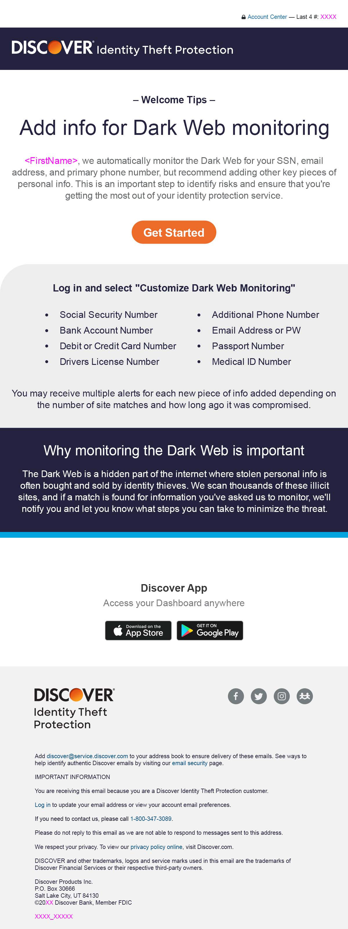
Customer Experience Enhancements
I also created new communications that would help onboard customers by urging them to add information for Dark Web monitoring, which was an important step to get the most value out of the service.
Also an email that would inform them about certain alerts they could "turn off" to avoid being notified about credit changes that they could be triggering regularly.
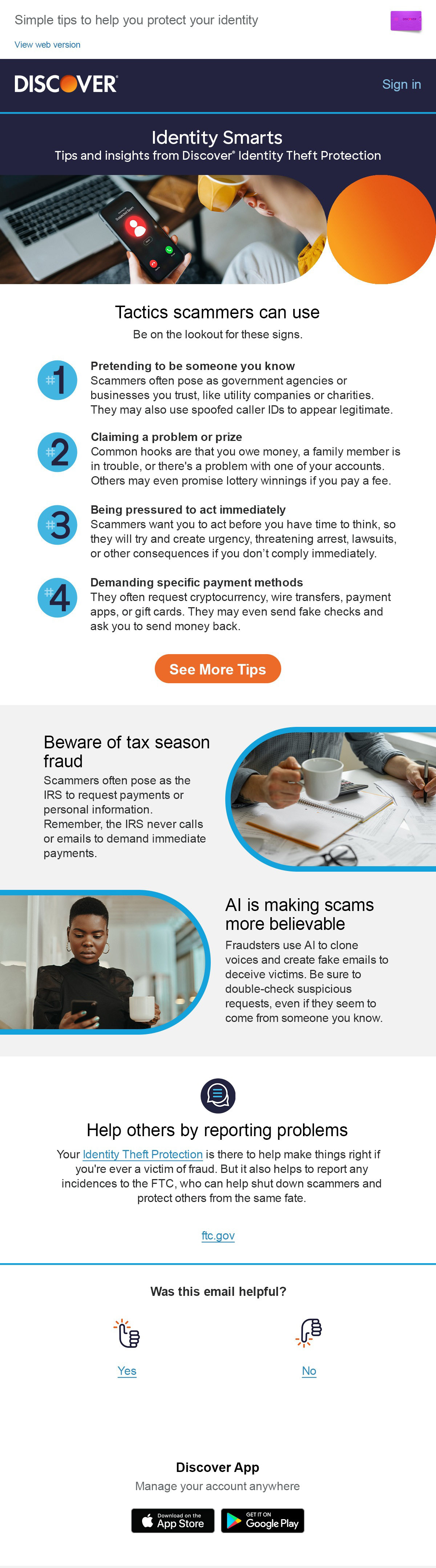
And a recent email was designed to act as a newsletter with helpful tips and info as a way to create more value for user's subscriptions.
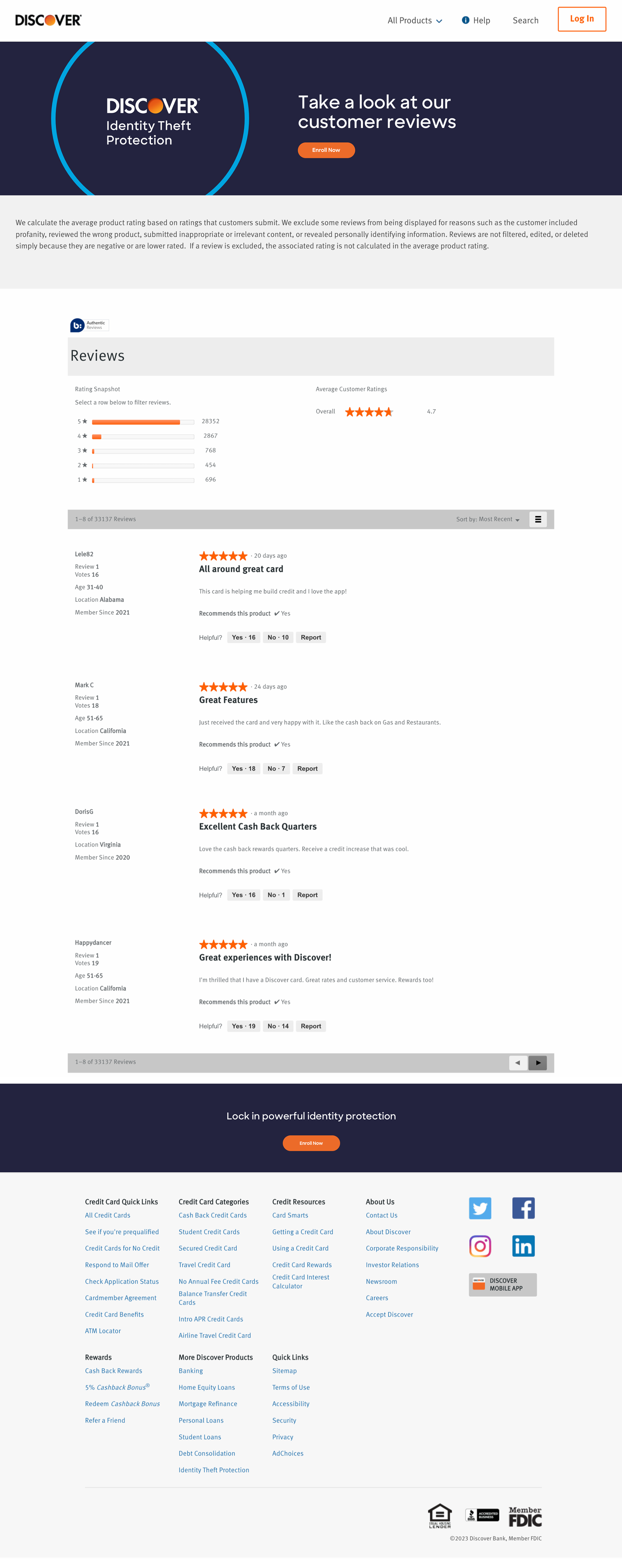
New Customer Reviews Page
We fairly recently created a mechanism for capturing customer reviews that could be used in marketing efforts, including this free-standing landing page. This allowed us to use the positive 4.7 or 5 star ratings to bolster prospect messaging.