Initial Content Design for Homepage Concepts
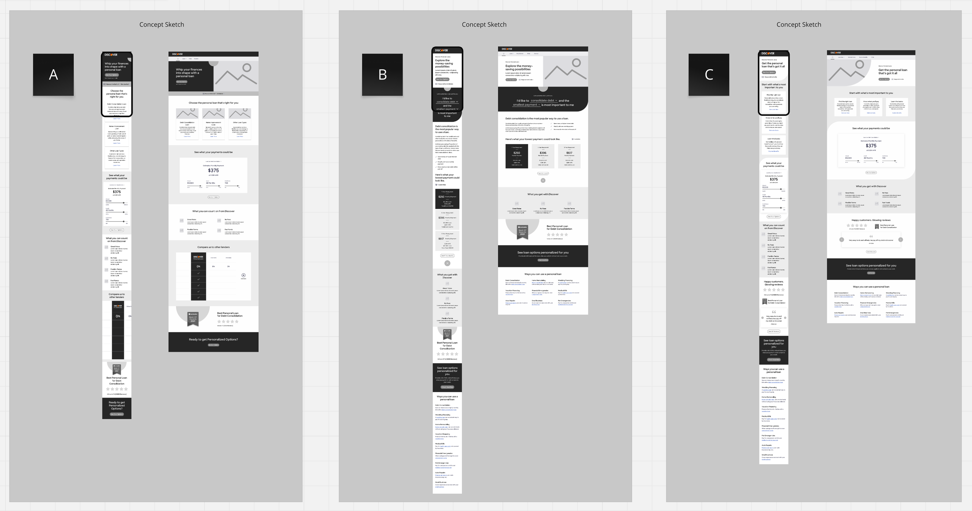
I worked closely with UX to refine 3 concepts from a client work session I led that also drew on key aspects of extensive research that was conducted prior to project start. These three themes for testing emerged.
1. Loan Uses - Lead with loan types but provide easy access to calculate payments
2. Personal Context - Allow users to interact and prioritize aspects of the loan they want
3. Educational - Meet users where they are—whether learning the basics or calculating payments
Preparing Design Stimulus for Testing
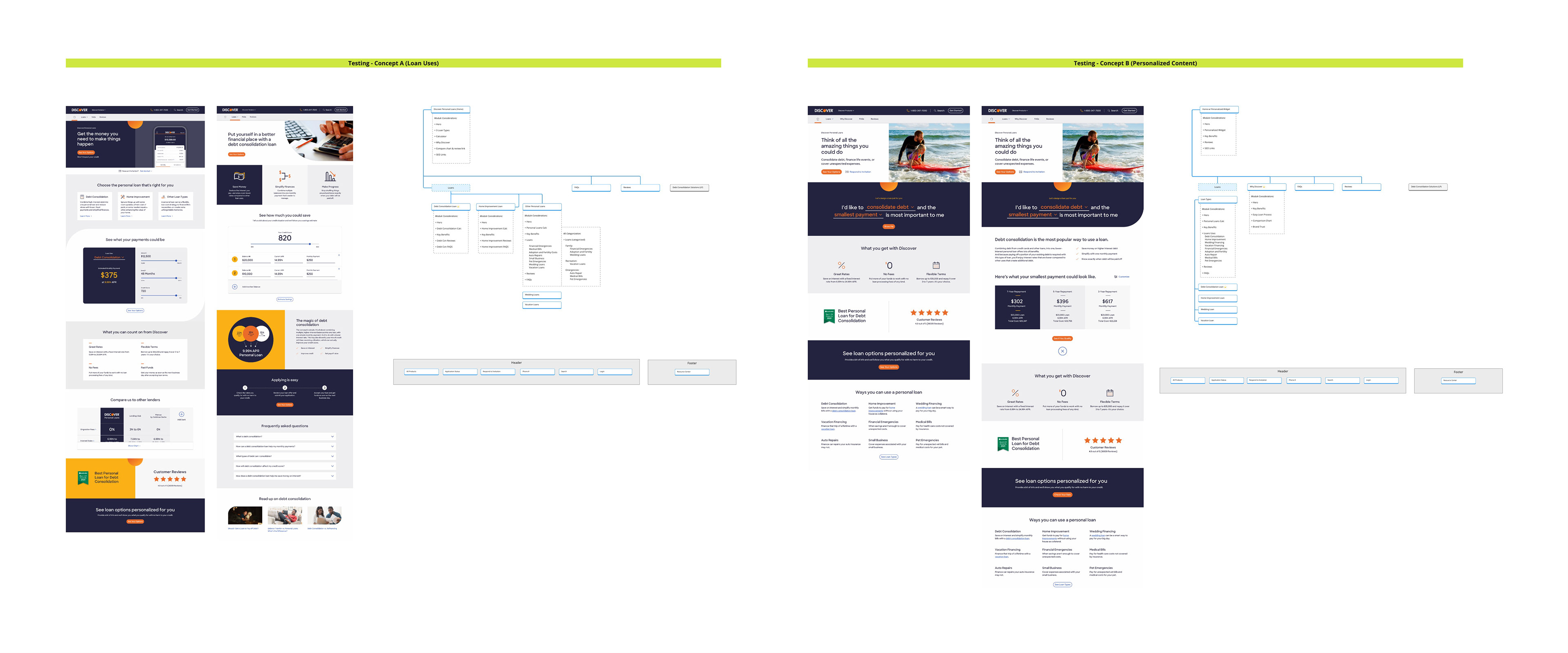
We tested the two strongest concepts: leading with loan uses of providing interactive personal contect. Our plan included two rounds of user testing
Concept testing
We planned to take at least two concepts from the early rounds of design into a moderated test—to learn what approach works best. And then use the learnings to design the remaining pages.
We planned to take at least two concepts from the early rounds of design into a moderated test—to learn what approach works best. And then use the learnings to design the remaining pages.
Validation testing
Prior to final design approval, we wanted to build a complete interactive prototype and run an unmoderated test to get additional feedback that could be applied to the design before coding.
Prior to final design approval, we wanted to build a complete interactive prototype and run an unmoderated test to get additional feedback that could be applied to the design before coding.
Designing the final site
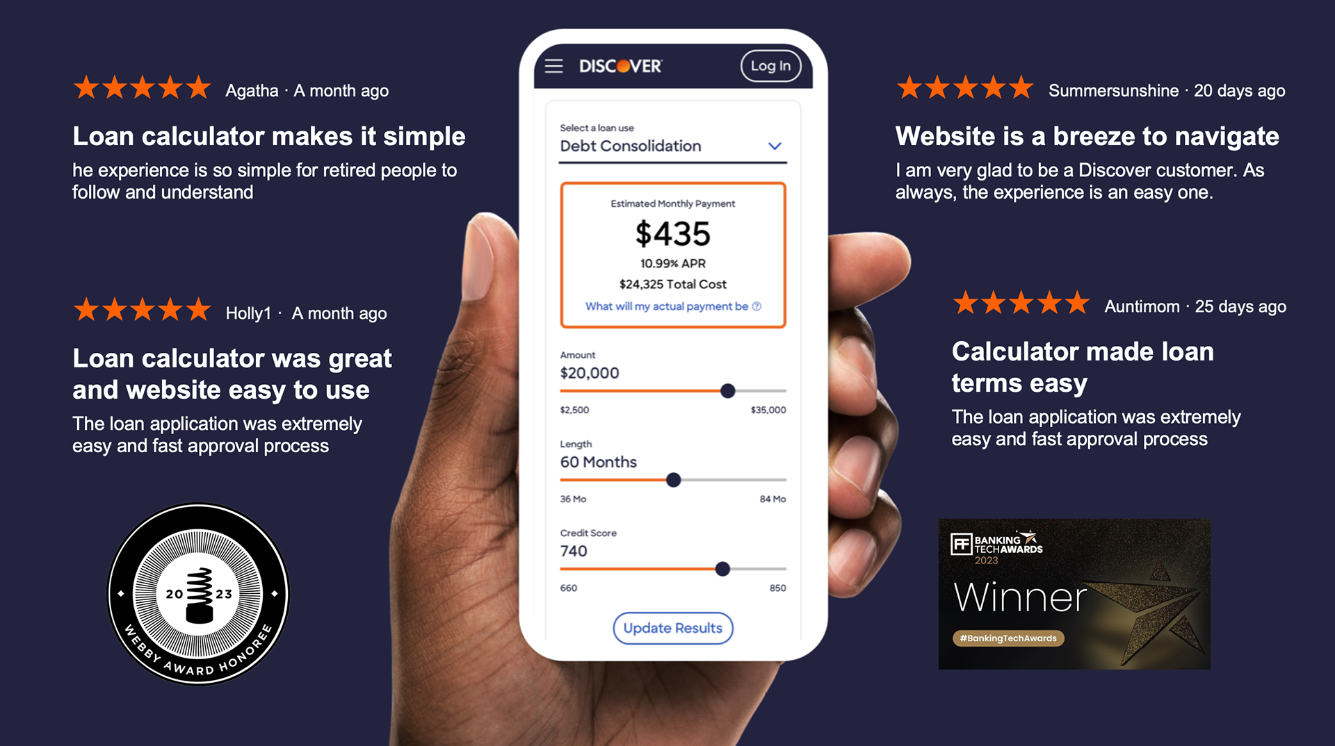
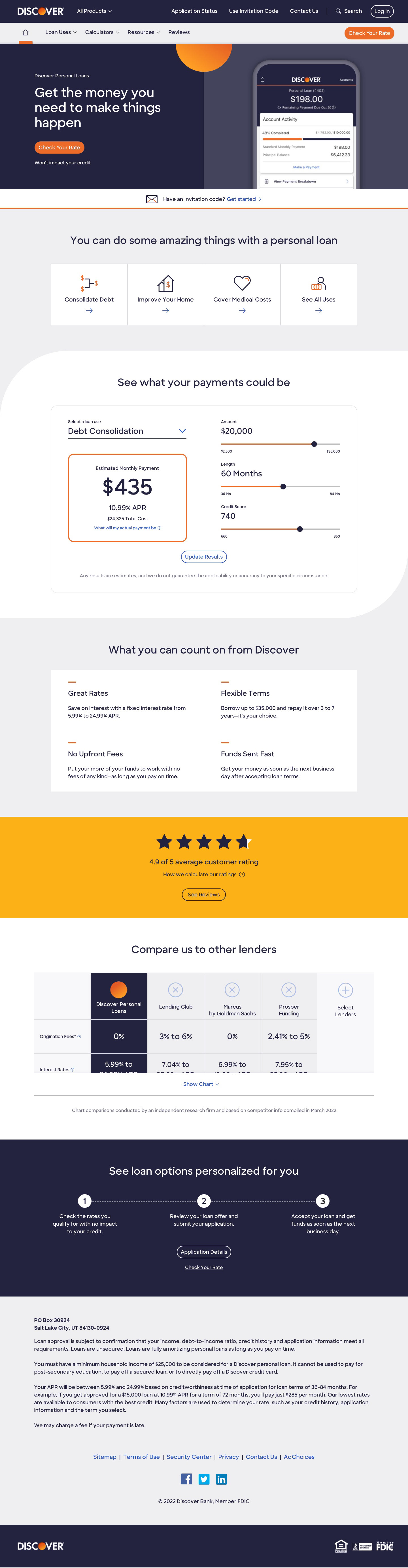
Testing gave us a clear design preference and strong positive reactions to copy, e.g., talking about money that you need, instead of a loan you’re taking out. And as I suspected, the calculator on the homepage was a huge hit. In fact, this final design ended up being very close the concept prototype because it tested so well.
I worked hand-in-hand with the design team on Miro, providing copy updates, reviewing comps, and iterating quickly to execute the final design.
I wrote all the UX elements and marketing copy To boost SEO, site pages included main use cases, like debt consolidation, but also an overview that gave prospects permission to use a loan any way they saw fit. Educational pages explained the process, and even defined what a personal loan is, to make prospects more comfortable that a Discover loan was the right choice for them—all helping to capture organic traffic.
Homepage
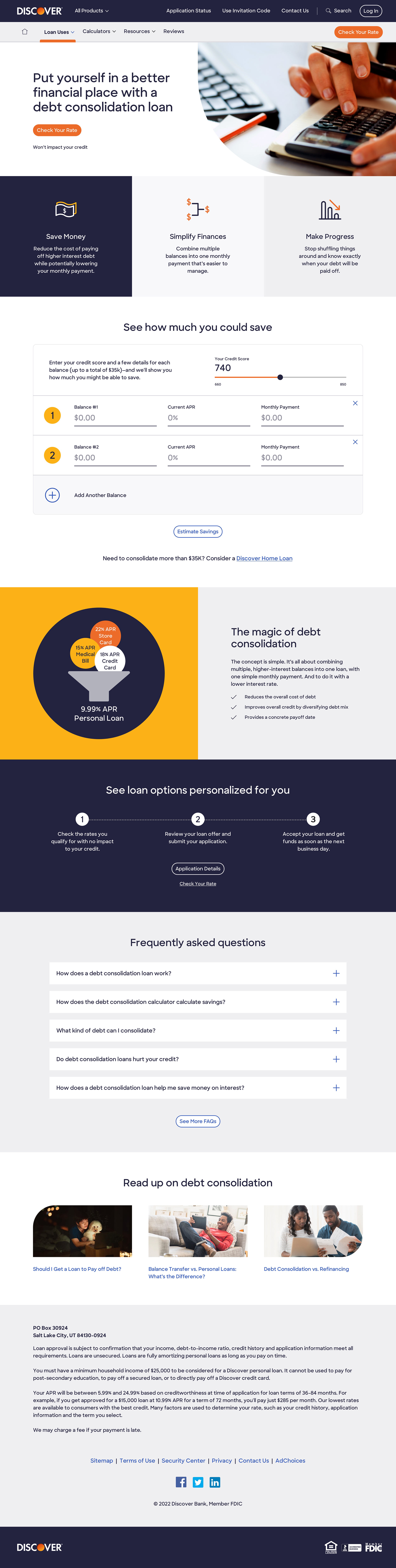
Debt Consolidation Page
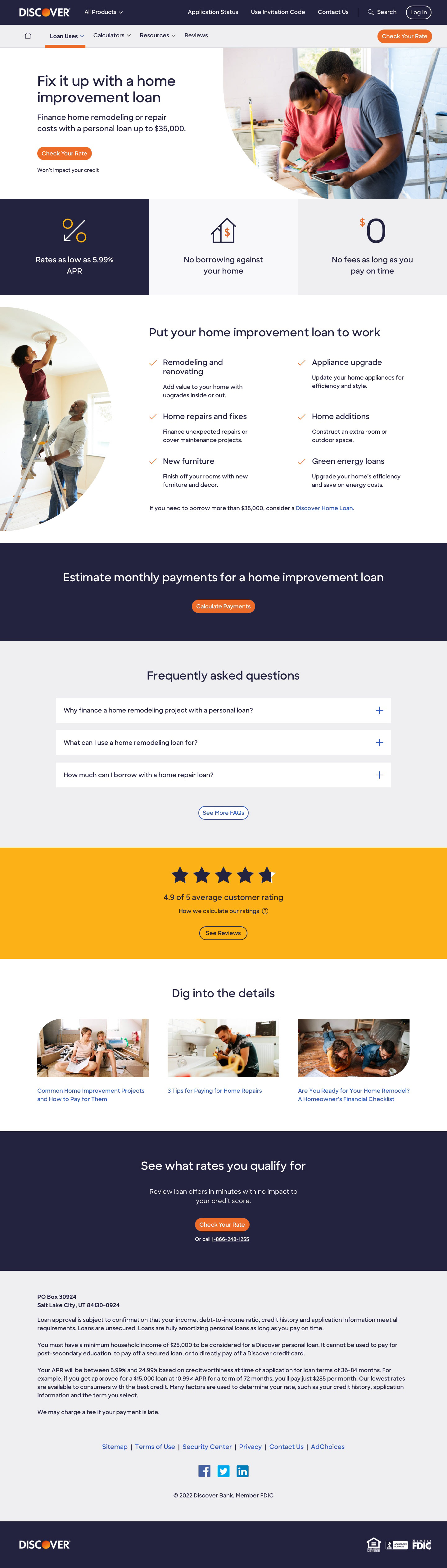
Home Improvement Page
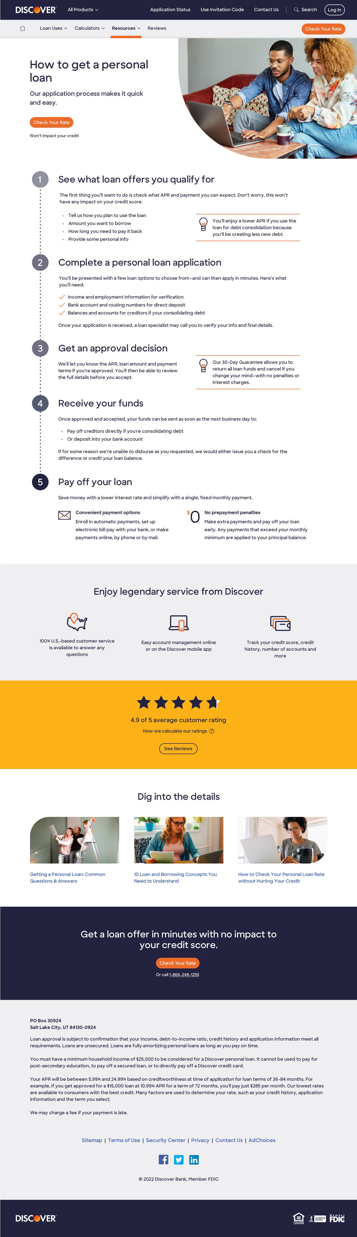
Loan Process Page
The new site saw a 5% initial increase in conversion—our main objective
Initial results showed a significant incremental increase in application start rates and improvements in other key metrics such as bounce rates and page visits per session.
The redesign was also recognized as a 2023 Webby Honoree for Best User Interface and won a 2023 Banking Tech Award.